
- interactive card fills were moved from animating
clip-pathto composited animation oftransform: the fill still expands from the cursor, while Safari, Firefox and less powerful devices handle the animation more smoothly. - a quick second hover no longer moves a shrinking circle to a new point: the fill resumes smoothly from its previous position and size.
- the reduced-motion browser test for “My path” now waits for fonts and accurate ScrollTrigger geometry, removing a layout timing race.
hidden page
Site journal
Site pages
- / home: direction, projects, my path, an introduction to me, the public archive and contact details.
- /about/ about me: five sides of the same work — entrepreneurship, creativity, development, strategy and design.
- /archive/ public archive: articles, notes, products and future books.
- /admin/ private admin panel: publications, the editor, media library and overview.
- /changelog/ this page. It’s hidden from navigation and opens when you click the version in the footer.
Version history
- the admin interface was refined: cleaner navigation, fewer repeated section headings and subtler input focus styles.
- terminology was tidied up: “Materials” became “Publications”, and “System” became “Brand kit”.
- the separate “Media” section was removed, and a handwritten author signature was added to the sidebar.
- the admin sidebar now uses the official SVG logo. Its scale and vertical position were refined, and the current panel was added to the version gallery.
- the Brand kit build was fixed: the main palette is separated from studio exceptions, and copying CSS tokens gives clear feedback again.
- the mobile home layout was rebuilt: the five roles no longer overlap the portrait or arrow, and the interactive card opens below the photograph within the viewport.
- the About page gained comfortable margins, more consistent vertical spacing and responsive headings that fit the screen.
- on secondary pages, the mobile header now uses the monogram in place of the full name. Back links share consistent heights, corners, typography and positioning.
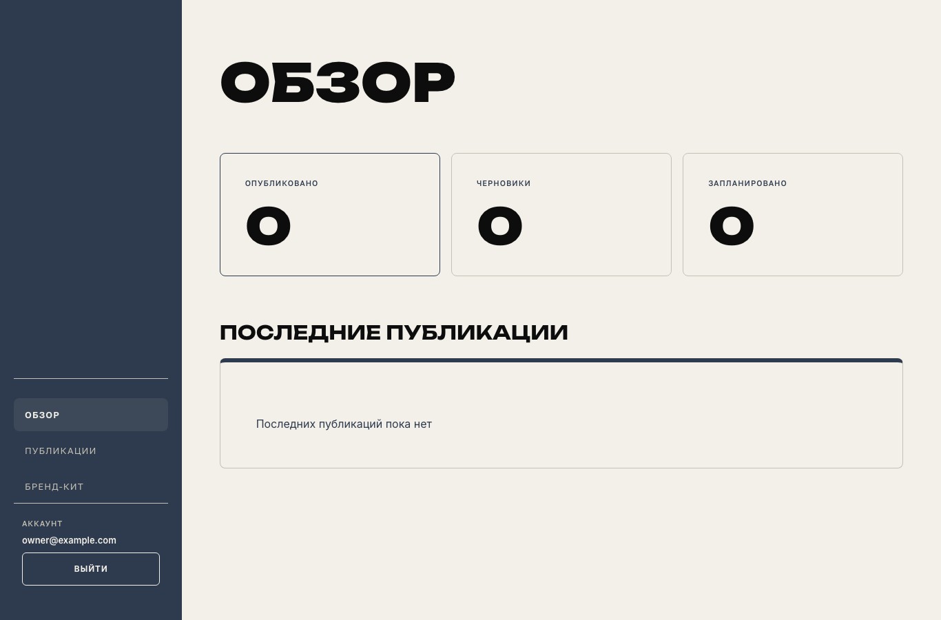
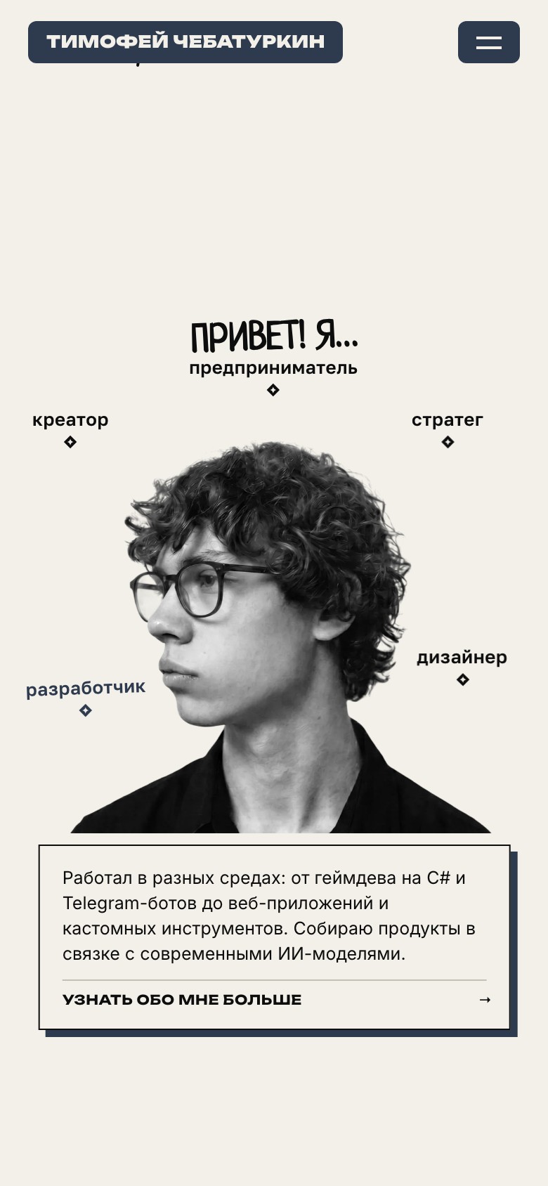
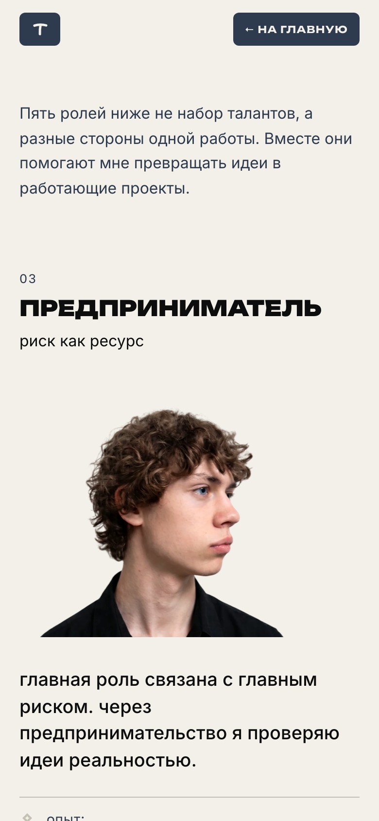
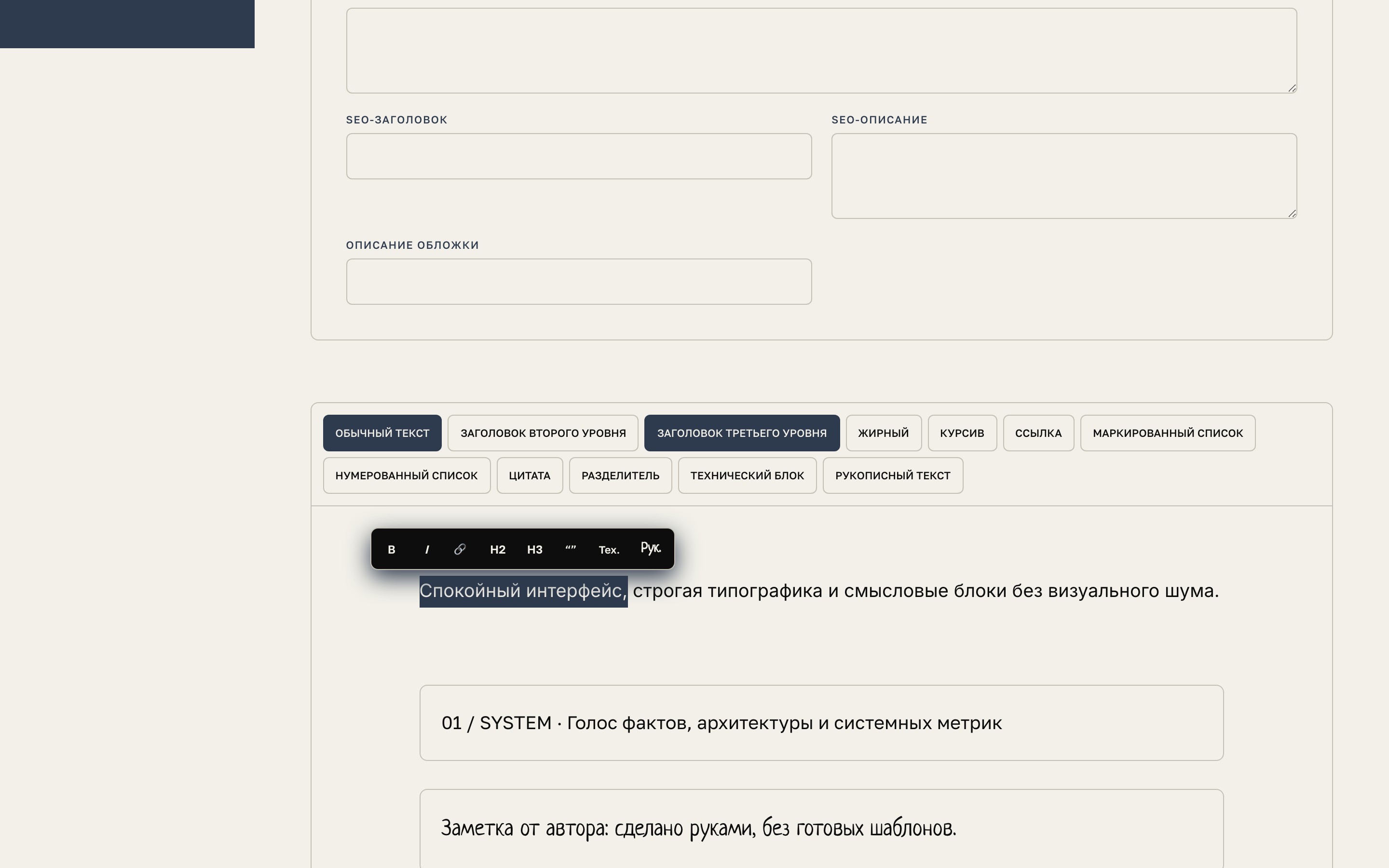
- TipTap gained a right-click context menu and a floating selection menu for quick formatting, headings, lists, quotes, technical blocks and handwritten notes.
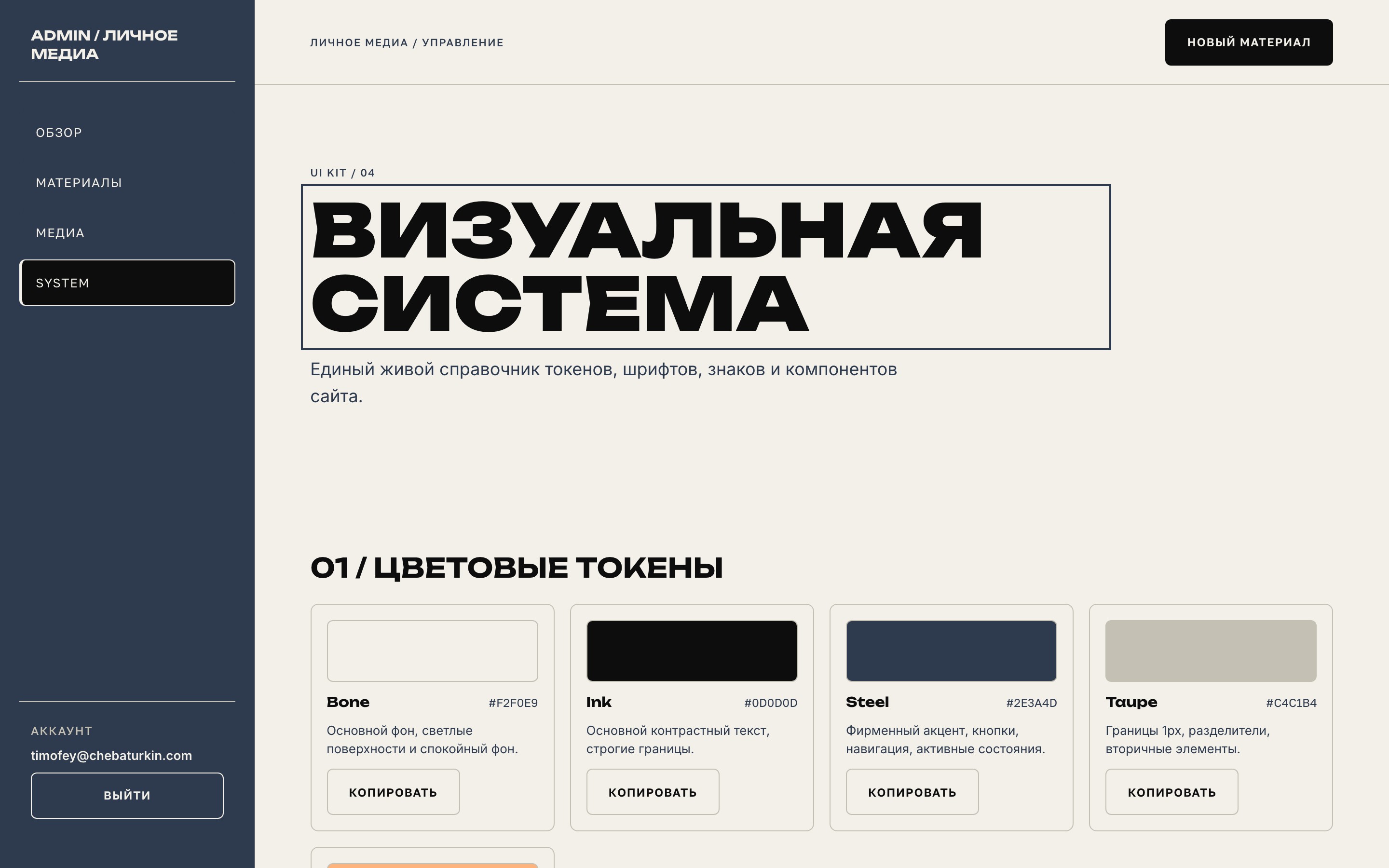
- the site’s visual system (/admin/system/) was integrated into the admin panel: interactive token cards with CSS copying, a typography showcase and a catalogue of marks and logos available as SVG and PNG downloads.
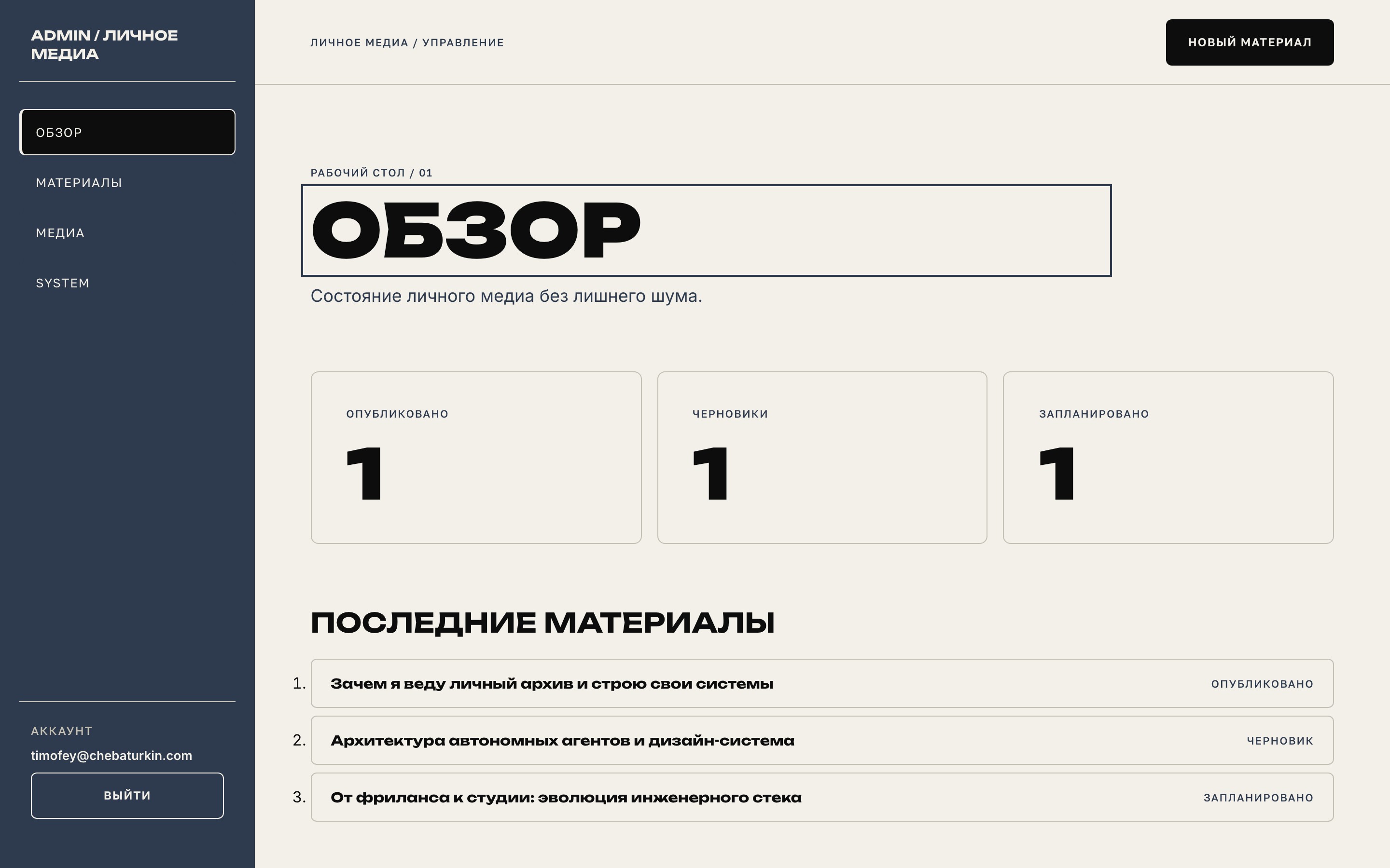
- recent publications in the overview became links for quick access to the article editor.
- mobile layout and hero role-card positioning were refined. The 404 page gained the updated footer and build timestamp.
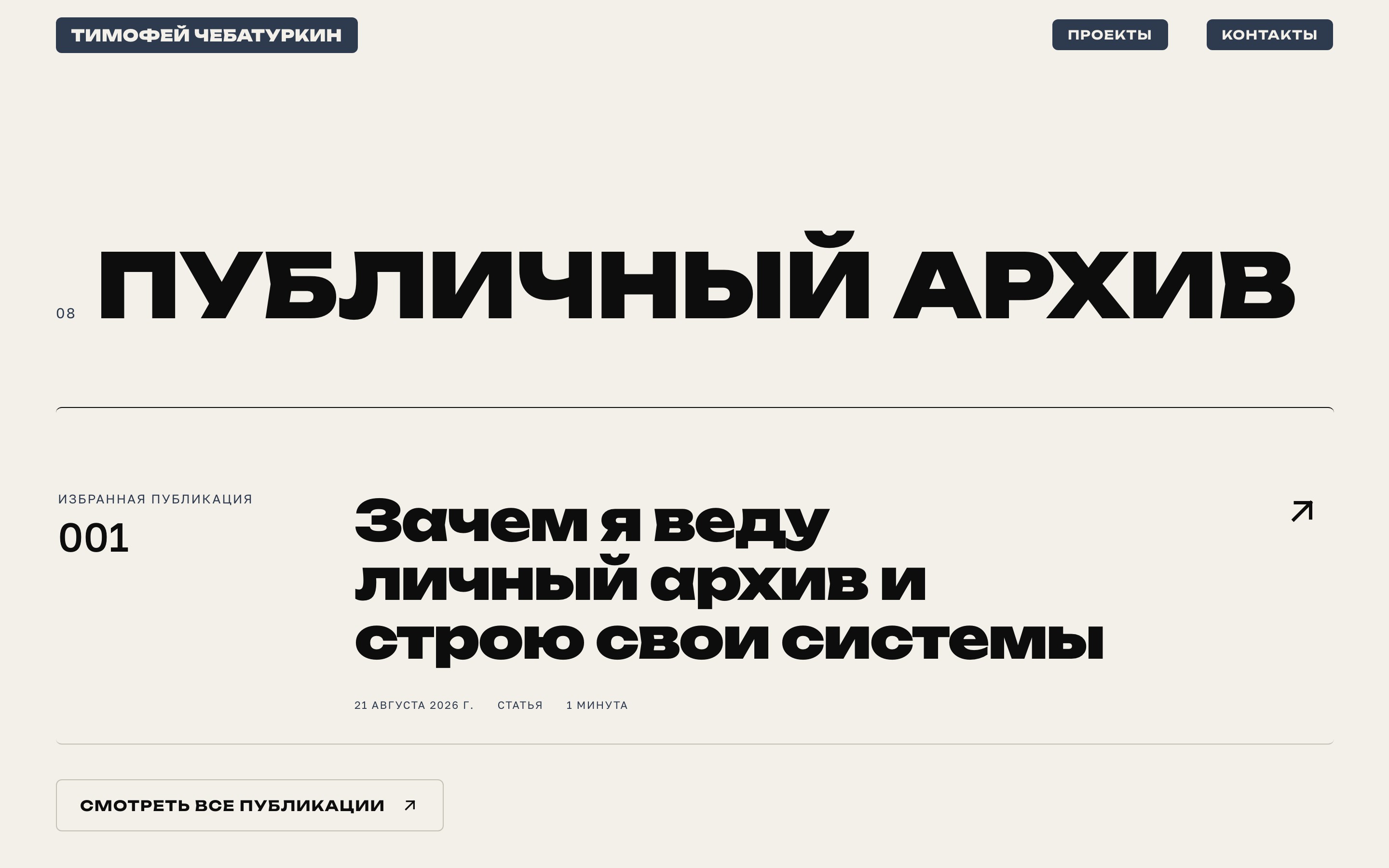
- the archive link on the home page became an interactive button with a magnetic arrow and a hover fill.
- footers were made consistent across the site: the back-to-top link uses the mono font, with the handwritten signature below it.
- tags were removed from the “My path” milestones to keep the focus on each period’s main results.
- the descriptions of my channels on the home page were refined.
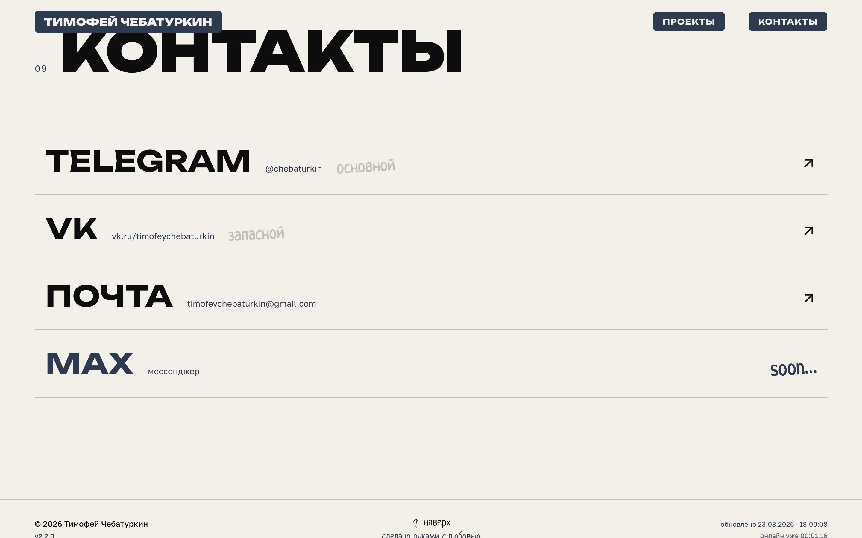
- handwritten typography was unified around Neucha. Caveat was removed, and handwritten styles across the public site and admin panel were standardised.
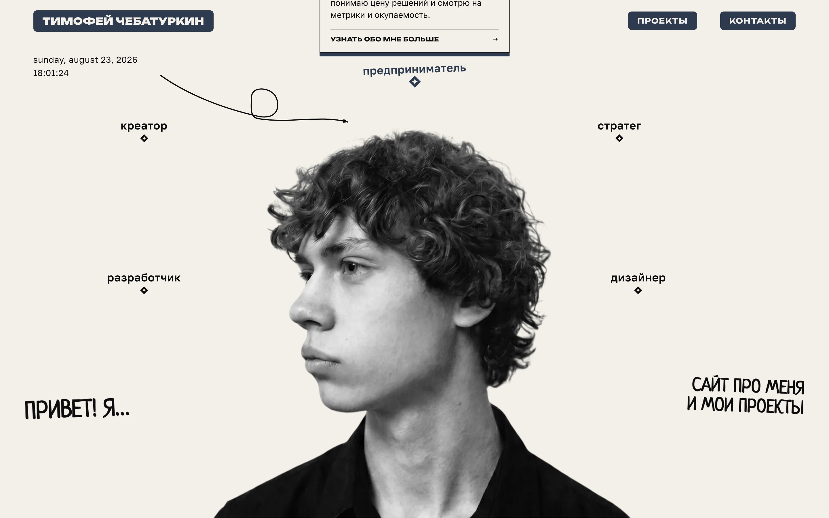
- the home page hero gained interactive experience cards for each role. The separate introduction was folded into the main story.
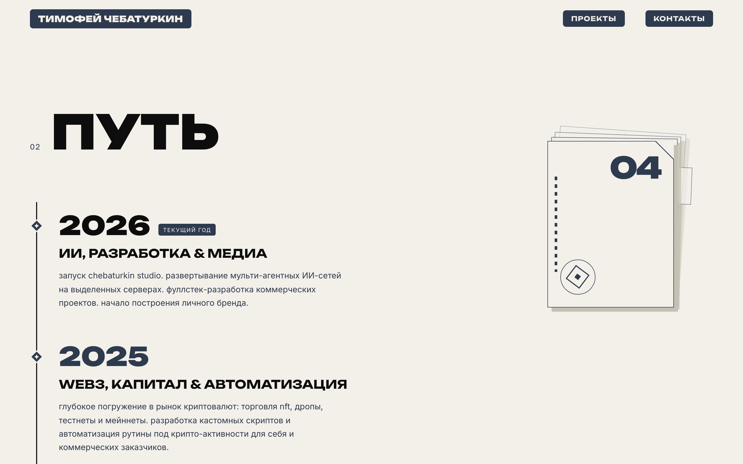
- “My path” was redesigned: the milestones became archive-folder cards, with smooth scroll synchronisation and animated layer changes.
- section headings were simplified, footer typography was aligned, and design-system contract tests were updated.
- the public archive became an author’s blog powered by Supabase: notes, articles and entries are stored in the database, while RLS rules hide drafts and scheduled content.
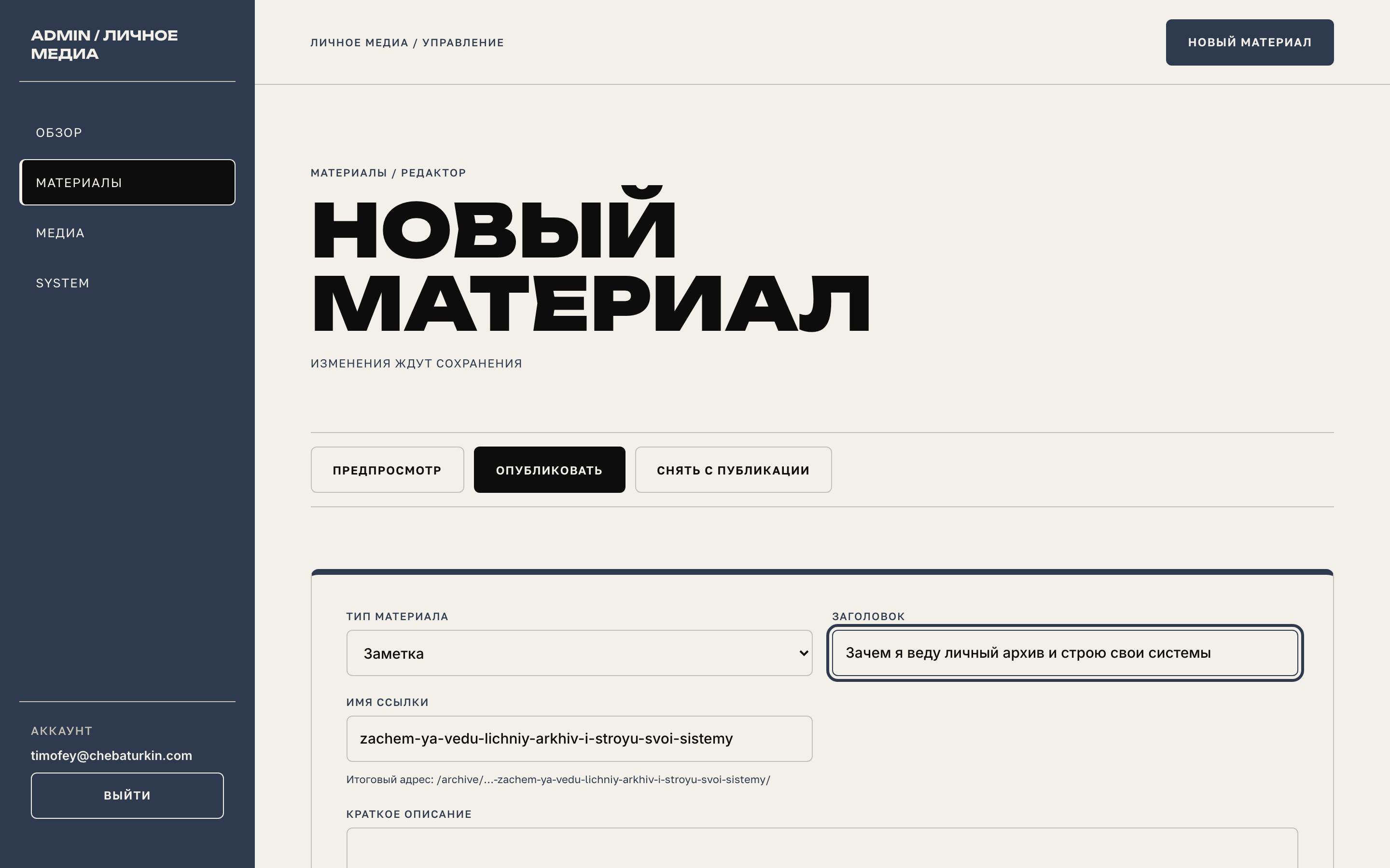
- a private admin panel was added with email and password login, a publications overview, filters, a media library, previews, autosave and an editor for the site’s custom content blocks.
- the UI kit moved into the protected `/admin/system/`, bringing the visual system and working tools into one space.
- the “Link name” field lets the author choose a readable slug. After first publication, the number and name become part of a permanent address such as `/archive/000-link-name/`.
- the archive, individual publications and featured home card load current Supabase data through clean URLs without query parameters.
- everything runs on the existing static Timeweb hosting. The repository includes minified bundles and only the public publishable key.
- the placeholder note was removed. The archive now waits for the author’s first publication through the new panel.
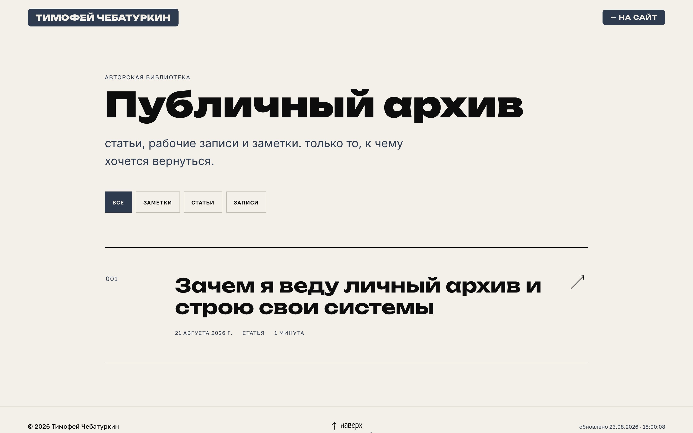
- the “Now” section was replaced with a public archive: a separate collection of observations about media, projects and technology, beginning with a note about its purpose.
- Chebaturkin Studio became the flagship project, with new copy, its own wordmark and a more prominent home-page presentation.
- the hero’s behaviour after early scrolling was fixed. Navigation and archive cards were adapted for mobile screens.
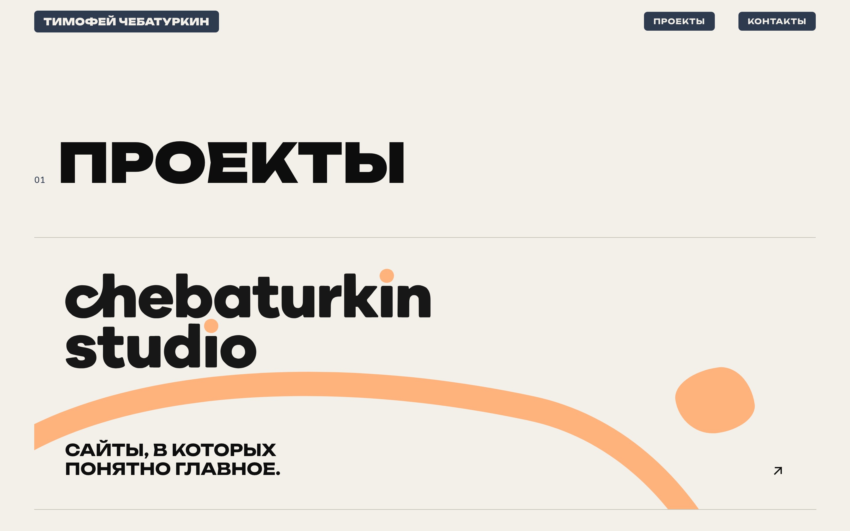
- the home page’s direction became clearer: writing and videos, projects, entrepreneurship, design and technology.
- “Projects” moved directly after “Direction”, and section numbering was updated to match the new order.
- the brand monogram was added to the preloader, favicon and home-screen icon. The decorative diamond kept its own role.
- the first complete version became the starting point for this journal. The version number in the footer opens this hidden page.
- the home page at that point: a hero with five roles and changing portraits, direction, a path with an animated timeline, role chapters, projects, a “Now” section and contacts.